Understand what saturation changes
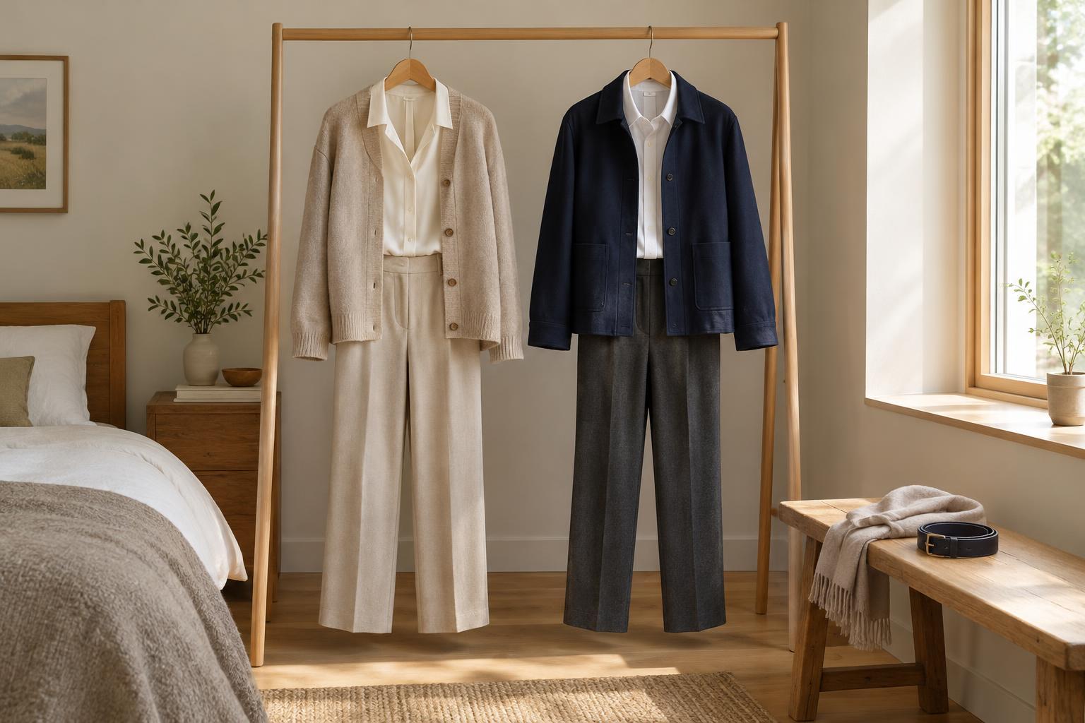
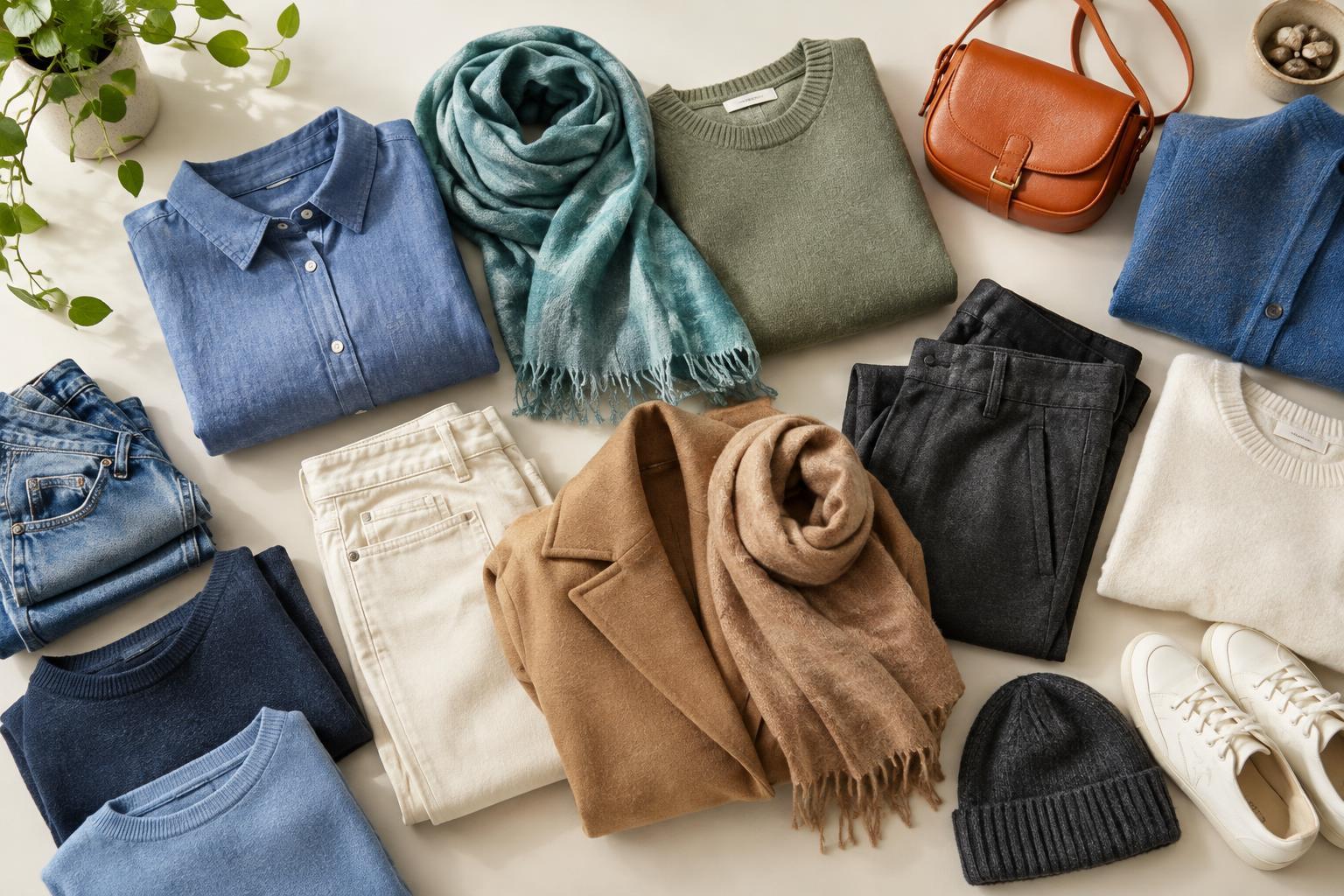
Saturation describes how vivid or subdued a colour looks. A bright cobalt blue has a clear, strong presence; a muted slate blue looks softer and greyer. Neither is automatically easier to wear. They simply create different impressions, and the amount of each you use can change the feel of an outfit.
Saturation is separate from how light or dark a colour is. Pale pink can be quite bright if it looks clear, while a dark olive can be muted. When planning an outfit, it helps to ask two questions: How light or dark are these pieces, and how vivid are they? That distinction makes colour combinations easier to understand than labelling every shade simply “bold” or “neutral.”
Choose one place for the strongest colour
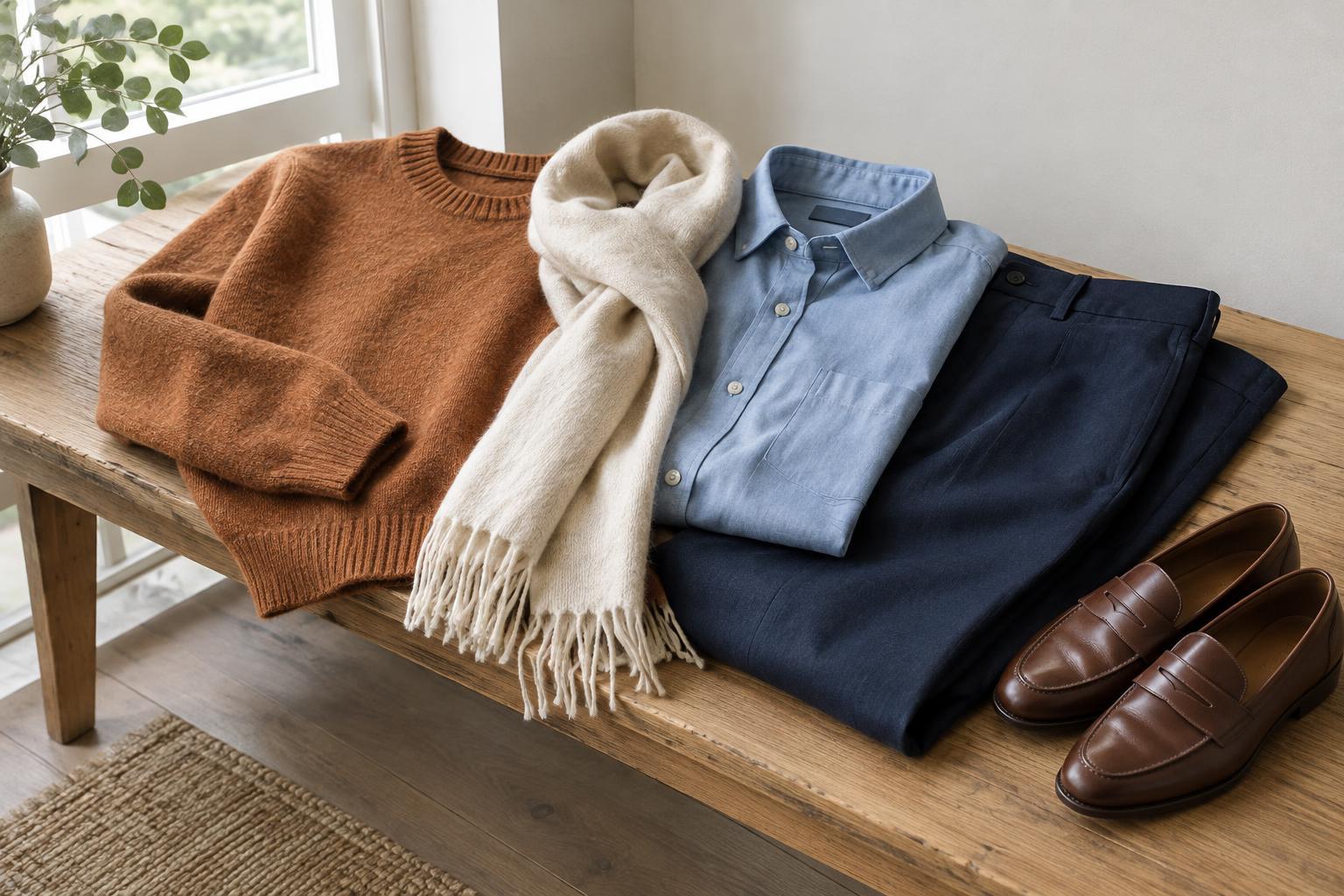
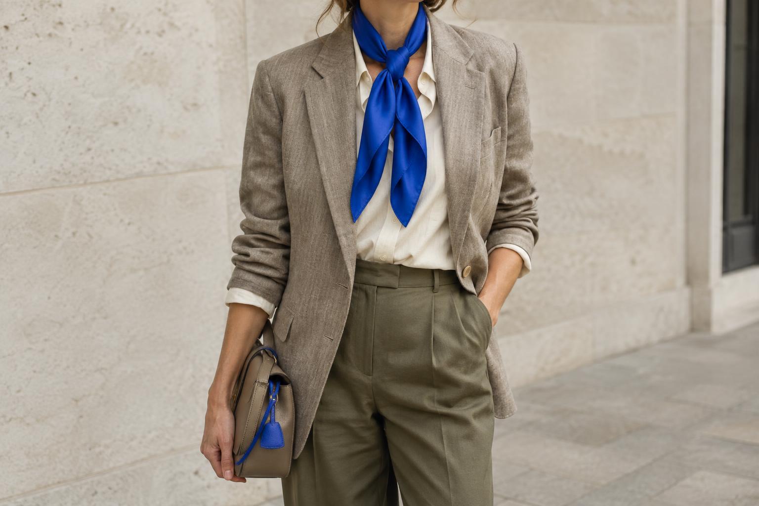
A straightforward starting point is to give the brightest piece a clear role. If you want a vivid green jumper to stand out, try it with muted navy trousers and a soft grey coat. The other pieces provide a quieter setting without requiring everything to match. The same idea works on a smaller scale: a bright scarf can bring colour to an outfit built from subdued clothes.
You do not have to limit yourself to one bright item. Two vivid pieces can work together, especially when they are separated by a calmer colour or connected by a shared hue. For example, a colourful top and shoes may feel more intentional when the trousers and outer layer are restrained. If the result feels too busy, change just one piece before reconsidering the entire outfit.
Use repetition and proportion to create a connection
A small repeat can make a saturated accent feel like part of the outfit rather than an afterthought. A patterned scarf might contain a little of the colour in your shirt, or a bag might echo the hue of a bright sock. The shades need not be identical; a softer version of the same colour can create a gentler connection.
Proportion matters as much as colour choice. A vivid coat covers more of the outfit than a vivid belt, so it will have a stronger effect even if the two items are the same shade. If you enjoy bright colours but want a quieter overall look, keep the largest garments muted and add colour through accessories. If you want colour to lead, reverse that balance and let the muted pieces play a supporting role.
Let patterns and textures influence the balance
Patterns can bring several saturation levels into one outfit. A floral shirt with bright petals against a muted background gives you options: you could pick up one vivid shade in an accessory or wear it with trousers close to the background colour. Either approach creates a connection without trying to use every colour in the print.
Texture also affects how prominent a colour feels. A glossy or smooth surface may draw more attention than a soft, matte one in a similar shade. If a combination looks louder than you expected, consider the fabric as well as the colour. Swapping a shiny accessory for a matte one, or placing a textured layer over a bright top, may give you the balance you wanted.
Adjust the combination to your own eye
There is no fixed percentage of bright to muted colour that suits everyone. Start with clothes you already enjoy wearing, then try one change at a time. You might pair a familiar muted outfit with a vivid scarf, or soften a favourite bright shirt with washed denim. Looking at the full outfit, including shoes and outerwear, is more useful than judging colours side by side on a hanger.
Check the combination in the light where you are likely to wear it when practical, since colours can appear different under indoor lighting and daylight. Then notice what attracts your eye first. If it is the part of the outfit you meant to emphasise, the balance is doing its job. If not, reduce, move or repeat the strongest colour until the outfit feels right to you.