What contrast means in an outfit
Outfit contrast is the visible difference between its lightest and darkest parts. A white shirt with black trousers has strong light–dark contrast; a cream shirt with beige trousers has much less. Contrast is not the same as colour. Navy and burgundy may be different hues, but if both look similarly dark, they can sit together more quietly than navy and pale blue.
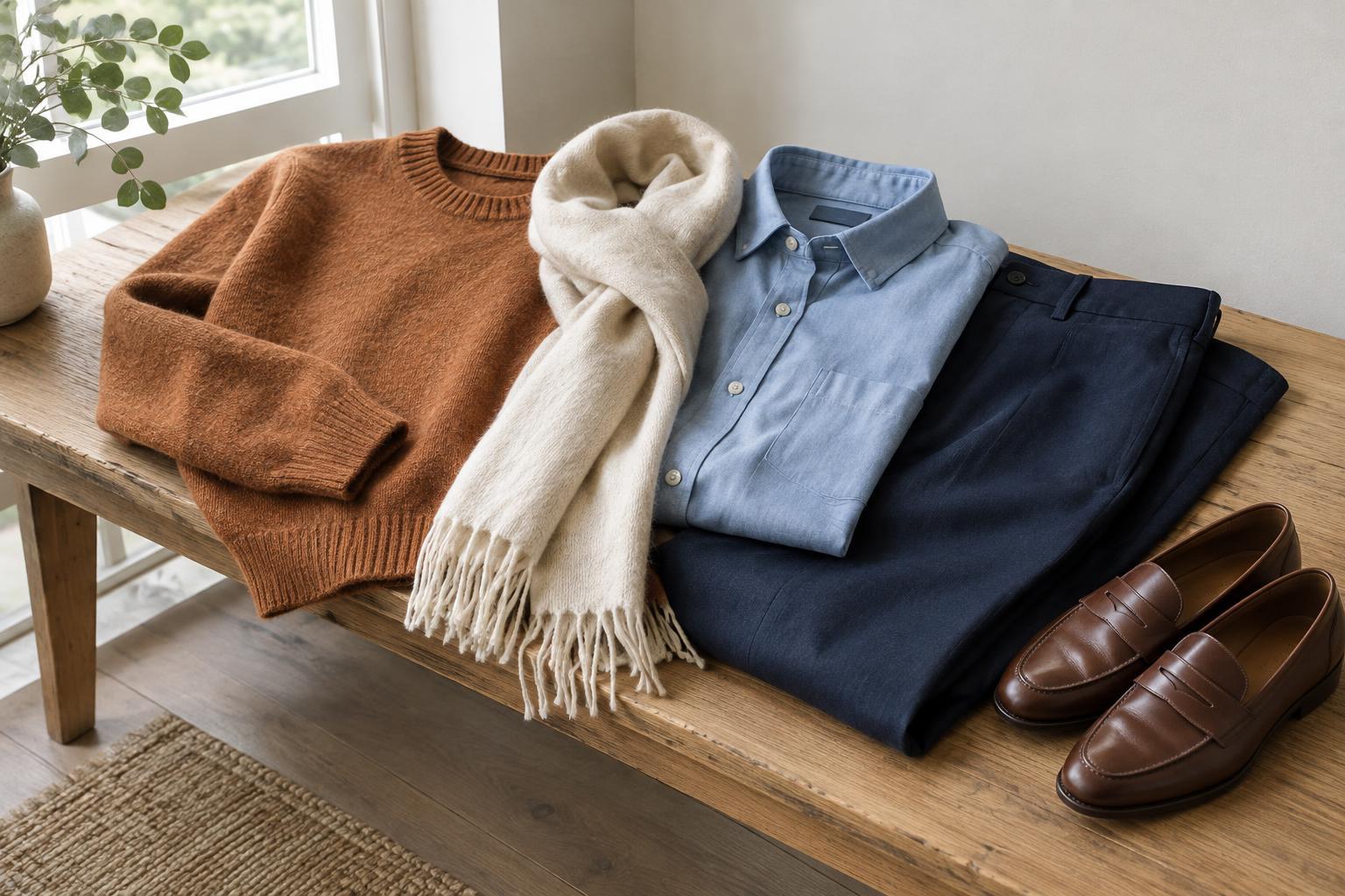
Neither high nor low contrast is automatically better. A strong difference can make an outfit look crisp and defined, while a smaller difference can make its pieces flow together. The effect also depends on where each colour appears, how much space it covers and what sits beside it. A small dark belt against a light outfit creates a different impression from a dark coat worn over light trousers.
Where you place light and dark matters
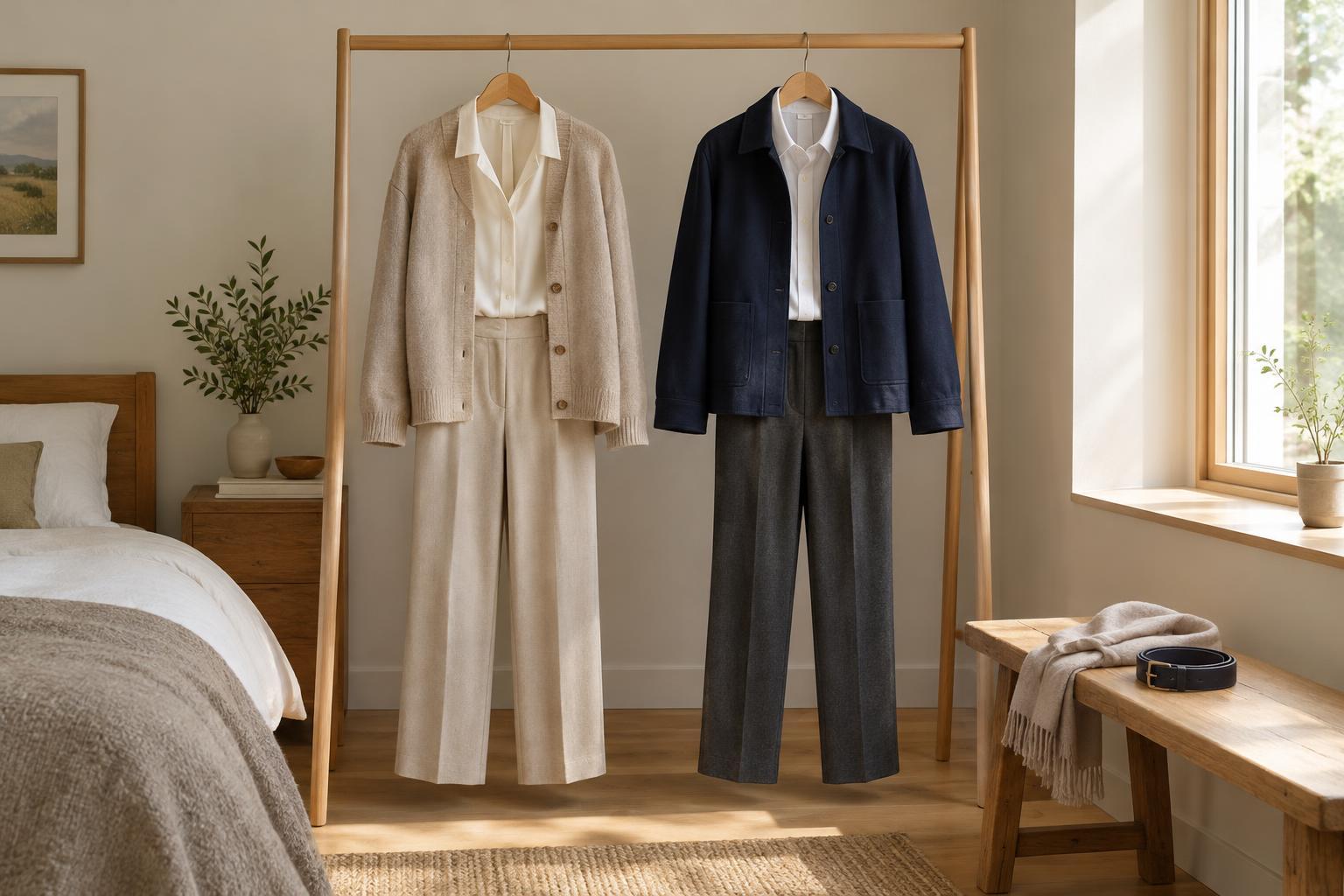
Contrast tends to draw attention to the point where light and dark meet. A pale top above dark trousers creates a clear division at the waist; a top and trousers in similar shades make that line less noticeable. If you want an outfit to feel more continuous, try keeping your main garments close in lightness. If you enjoy a clearly defined shape, pair a light garment with a dark one.
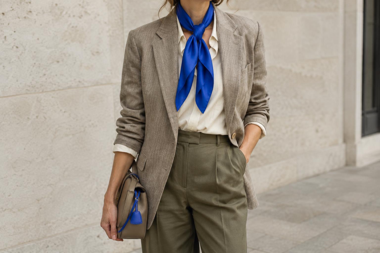
Think about what happens near your face, too. A light collar, dark scarf or contrasting neckline can make the upper part of an outfit more noticeable. There is no rule that everyone should wear a particular level of contrast near their face. Try a few options in ordinary daylight and notice which makes you feel comfortable and which draws attention where you want it.
Shoes and bags can repeat a light or dark shade already in the outfit. For example, dark shoes with dark trousers keep the lower half relatively uninterrupted, while light shoes against dark trousers add another point of contrast. Repeating a shade is useful when an accessory otherwise feels separate from the rest of the look.
Adjust the contrast without changing your whole wardrobe
You can make a high-contrast outfit softer by adding a middle shade. A grey cardigan between a white shirt and black trousers introduces a gentler transition. Another option is to swap one extreme for a nearby shade: cream instead of bright white, or charcoal instead of black. These changes preserve the basic combination while reducing the gap between its lightest and darkest pieces.
To give a low-contrast outfit more definition, add one noticeably lighter or darker item. A dark belt over a pale dress, a white T-shirt under a mid-tone jacket or a light scarf with a dark coat can do the job. The item does not need to be large. A small accessory creates a more restrained accent, while a coat or pair of trousers changes the contrast of the whole outfit.
Patterns offer another way to adjust the effect. A striped shirt can link light and dark garments if its stripes include both shades. If the pattern itself is strongly contrasting, however, it may become the busiest part of the outfit. Check the outfit as a whole rather than treating every piece as a separate colour choice.
Notice texture, scale and lighting
Light–dark contrast is easy to see in a simple photograph, but real clothing has texture and movement. A soft knit may give a dark-and-light pairing a relaxed feel, while smooth, sharply outlined pieces can make the same colour pairing look more defined. Prints, visible stitching and layered hems also introduce smaller areas of contrast that affect how busy an outfit feels.
The amount of each shade matters. A mostly dark outfit with a narrow pale collar feels different from an outfit split roughly between a pale top and dark trousers. Before changing a combination that feels too stark, consider whether you could change the proportions instead: leave less of a light shirt visible beneath a jacket, for example, or choose a smaller contrasting accessory.
Colours can also look different under changing light. When deciding whether two pieces work together, view them side by side in the light in which you expect to wear them, if possible. You do not need a perfect match; the aim is to see the overall effect clearly enough to make a choice you like.
Build a simple contrast check into outfit planning
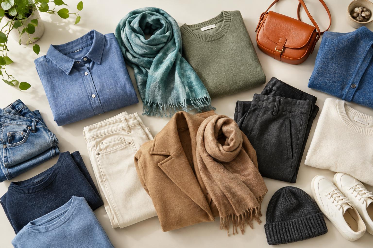
Start with two main garments and ask whether they are similar in lightness or clearly different. Then add shoes, an outer layer and any accessories one at a time. At each step, notice whether the new piece repeats an existing shade, bridges a gap or creates a new focal point. This quick check is often more useful than trying to follow a fixed formula.
If an outfit does not feel quite right, change just one thing. Swap a white top for a mid-tone one, remove a contrasting scarf or repeat the shade of your shoes in a bag. Comparing the versions helps you identify what you prefer. Over time, you may find that you like strong contrast for some occasions and quieter combinations for others. Both can belong in a practical wardrobe.