Start with the colours you already wear
A colour wheel arranges hues in a circle so you can see how they relate to one another. Red, yellow and blue are commonly shown as primary colours; orange, green and purple sit between them. For getting dressed, the most useful question is simple: do you want your colours to blend gently or create contrast?
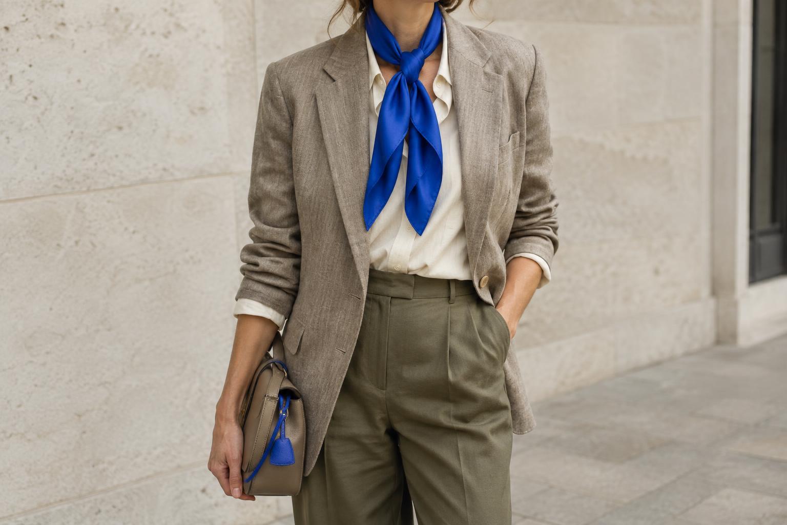
You do not need a perfect match between a garment and a spot on the wheel. Fabrics come in lighter, darker, brighter and more muted versions of each hue. A dusty blue shirt and a vivid cobalt scarf are both blue, but they give an outfit different moods. Use the wheel as a starting point, then look at the actual clothes together.
Begin with one piece you want to wear, such as a green jumper or a rust-coloured skirt. Treat it as your anchor colour. You can then choose a related hue for a quiet combination, an opposite hue for contrast, or a neutral to let the anchor stand out. This approach is often easier than trying to plan every colour at once.
Use neighbouring hues for a gentle combination
Colours next to one another on the wheel are called analogous colours. Blue with green, or red with orange, are familiar examples. Because the hues share some visual qualities, they can make an outfit feel connected even when the pieces are not the same colour.
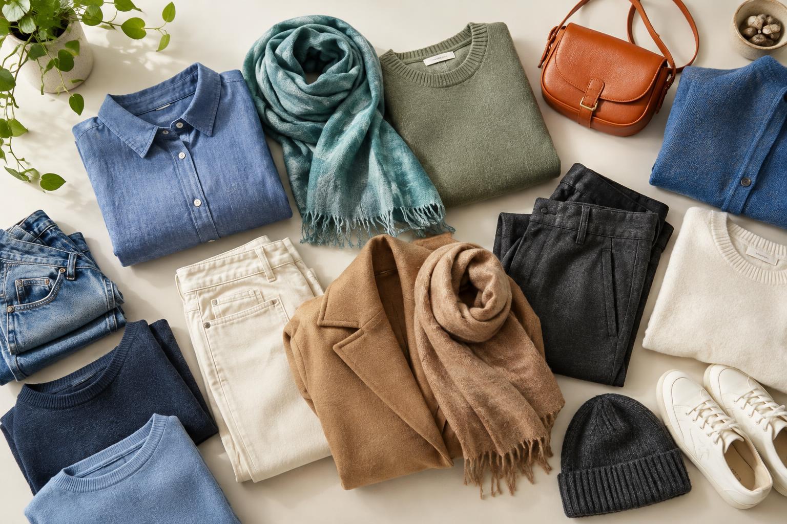
For an everyday version, try dark blue trousers with a soft blue shirt and a muted green cardigan. The trousers and shirt provide a close link, while the cardigan adds variety. If three coloured pieces feel like too much, use the third hue in a small accessory instead: a scarf, socks or a bag.
Pay attention to how strong each colour is. Two very bright neighbouring hues can still compete for attention. If you prefer a calmer look, combine one clear colour with a darker or softer neighbour. You can also leave space between coloured pieces with a neutral, such as a white shirt under a green jacket worn with blue jeans.
Try opposites when you want contrast
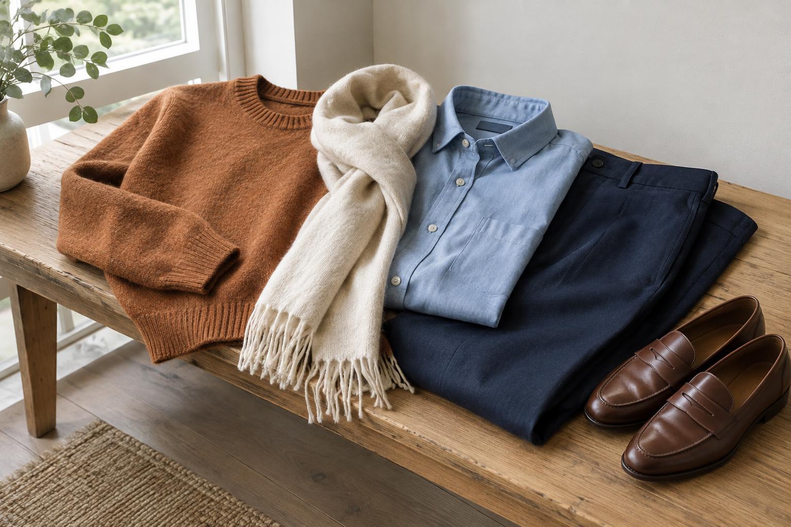
Colours across from each other on the wheel are complementary. Blue and orange, red and green, and yellow and purple are common pairings. Together, they create noticeable contrast. That does not mean you need to wear equal amounts of both colours or choose their brightest versions.
A practical way to try this is to make one colour dominant and use the other as an accent. A navy outfit with a rust scarf draws on the blue-and-orange relationship without looking overly bold. An olive jacket with a small burgundy accessory offers a softer take on red and green. The exact effect depends on the shades and fabrics you choose.
If a pairing feels too intense, change one element before abandoning it. Try a deeper shade, a faded tone or a smaller accessory. You can also add a neutral layer between the colours. For example, a white top can separate a purple skirt from a yellow bag while allowing both to remain part of the outfit.
Let neutrals and tonal dressing do some of the work
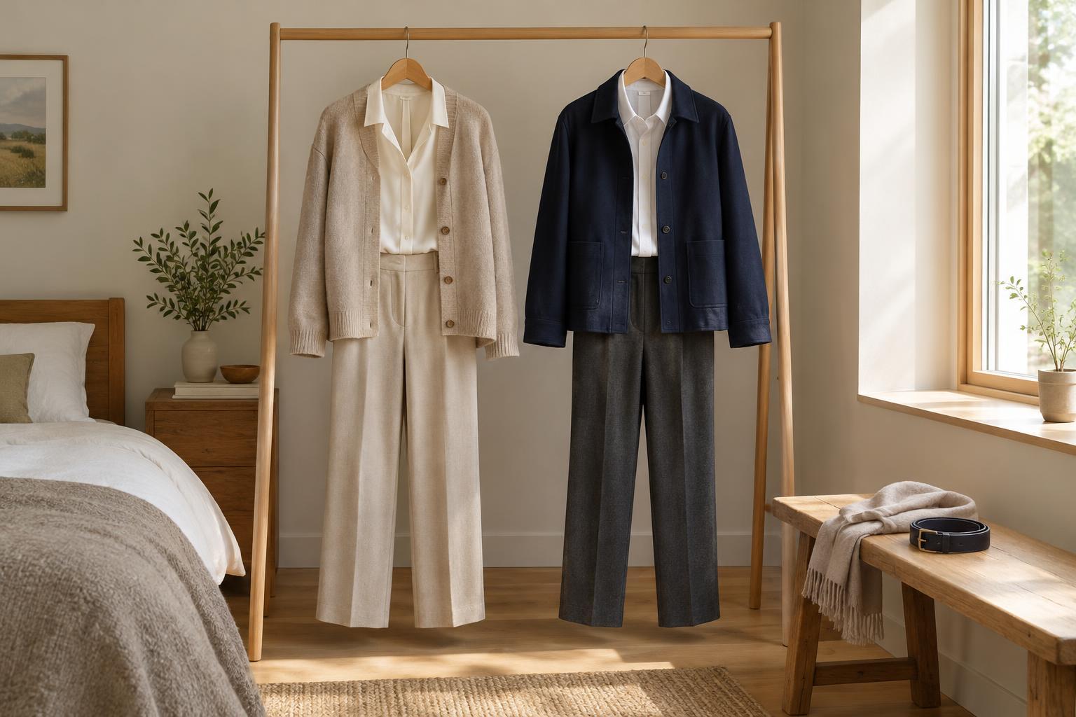
Black, white, grey, cream and many shades of brown are useful companions to the colour wheel. Denim often works in a similar way in a casual wardrobe. These pieces give the eye a place to rest and make colourful garments easier to wear repeatedly.
One simple outfit formula is one colour plus one or two neutrals: a red knit with charcoal trousers, or a blue shirt with cream trousers and brown shoes. Another is tonal dressing, which uses several versions of the same hue. A pale blue shirt, mid-blue jeans and a navy coat make a coherent outfit without needing a second bright colour.
Neutrals are not interchangeable in every outfit. Cream may feel softer beside a muted green than stark white does, while black may sharpen the contrast with a bright yellow. Notice whether your neutral supports the effect you want rather than assuming it will disappear into the background.
Test combinations with your own clothes
When you are unsure, lay two or three garments together in natural light. Look at them from a little distance: does one piece take over, or do the colours feel balanced to you? Texture and pattern matter too. A patterned scarf can connect colours already present in a plain top and jacket, even if the pattern contains several hues.
For a low-effort routine, choose an anchor garment, add one wheel-based relationship, then finish with a neutral. You might pair a purple top with a muted yellow accessory and grey trousers, or a green shirt with blue jeans and a cream jacket. If the result feels busy, remove a colour or make one of the coloured pieces smaller.
The colour wheel offers possibilities, not rules about what you should wear. Your preferred level of contrast, the clothes you own and the setting all matter. Save combinations that make you feel comfortable, and use them as reliable starting points when you want to get dressed without overthinking it.